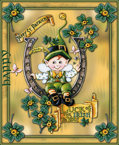
For this tutorial you will need a tube.
No outside filters were used.
This is a 2 part tutorial. Both parts I have tried to explain and done enough screen shots that I will call it Advanced Beginners.
If you are not into doing animations, the tag will be fine at the end of part 1 :-)
First we have to make the basic tag.
Open your chosen tube in PSP. Shift+D to duplicate, twice, so you have 2 copies, minimize one of them. Close the original.
Choose a light color from the tube for the Foreground color, and a dark color for the Background.
Activate the tube.
Layers-Add New Raster Layer.
Layers-Arrange-Send to Bottom.
Floodfill this layer with your lighter Foreground color.
In the layer palette, highlight the tube layer, Layers-Duplicate.
Highlight the middle layer, Adjust-Blur-Gaussian Blur with a Radius of 10.
Layers-Duplicate. Image-Mirror.
Highlight the top blurred layer and Layers-Merge-Merge Down.
You should now have the top layer the tube, the middle layer the blurred, and the bottom layer the solid color.
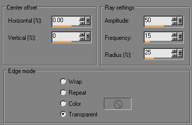
With the blurred layer highlighted, Effects-Distortion Effects-Spiky Halo with these settings.
Adjust-Brightness and Contrast with Brightness at 20 and Contrast at 20.
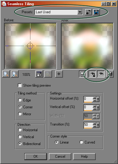
Effects-Image Effects-Seamless Tile at the Default setting.
** Tips time :-)
In the example below, the top ellipse, you can click on the second little box with the semi-circle arrow to reset the tool to Default, works the same in most of PSP's tools, or you can click the drop down in Presets and look for the Default setting. If you work a tut, and find you like the way a setting looks, you can click the last little box with the Floppy Disk icon and save that setting to your Presets.
**Second Tip
The second ellipse, middle right, if you depress these 2 buttons, you will see the changes to your main work before you actually change it, allowing you to make changes and see them while you are still in the tool.
Selections-Select All
Selections-Float.
Effects-3d-Cutout. My fav for this is, V & H at 0, opacity 100, Blur 15.
Selections-None.
Image-Add Borders, 2 px symetrical, your Backgound color.
Image-Add Borders, 2 px symetrical, your Foreground color.
Image-Add Borders, 2 px symetrical, your Background color.
Image-Add Borders, 20 px symetrical, your Foreground color.
With your Magic Wand, choose this border.
Adjust-Add/Remove Noise-Add Noise. Gaussian ticked, Noise at 10, and Monochrome checked.
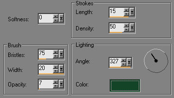
Effects-Art Media-Brush Strokes, with these settings.
Effects-3d-Cutout, same settings as before, which should still be there.
Image-Add Borders, 2 px, your Background color.
Image-Add Borders, 2 px, your Foreground color.
Image-Add Borders, 2 px, your Background color.
Your basic tag is now done :-)
Now we're going to work on pulling out the shamrock and butterfly to use for the corners and decoration.
This is still Part 1 of the tut :-) The butterfly I used in the animated part, but you could also use it as added decoration for the static tag.
Maximize the copy of the original tube that's been waiting for this step.
If you are using a different tube than in the supplies, it shouldn't matter, there should be something it in you can "pull out" to decorate with.
With your Zoom tool, icon looks like a magnifing glass, with these settings.
That will make the image easy to work with.
Now, choose the Freehand Selection tool, found in the flyout with the Magic Wand with these settings.
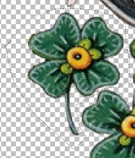
At that magnification, you can see that shamrock at the bottom left in the tube is already ripe for the pickens :-)
Start clicking around it, careful to stay in the open areas, and then double click when you get back to the start.
Edit-Copy. Edit-Paste as a New Image.
Selections-None.
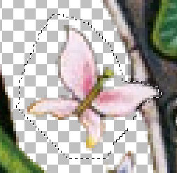
For the butterfly, part of it was in the tube. This takes a bit more care. If at any time you are not happy with how it's looking, double click and Edit-Undo, then start again :-)
And if you are using a different tube, you may need to take this part carefully.
Anything that is "in the tube" you will need to click more often to stay close to the edges of what you are pulling out.
If I was pulling a rose from a bouquet graphic, I would try to stay just inside the rose edges.
Remember you are at 400% magnification, what looks like sharp angles may look fine when you are done.
My butterfly looks like this.
Edit-Copy. Edit-Paste-As a New Image.
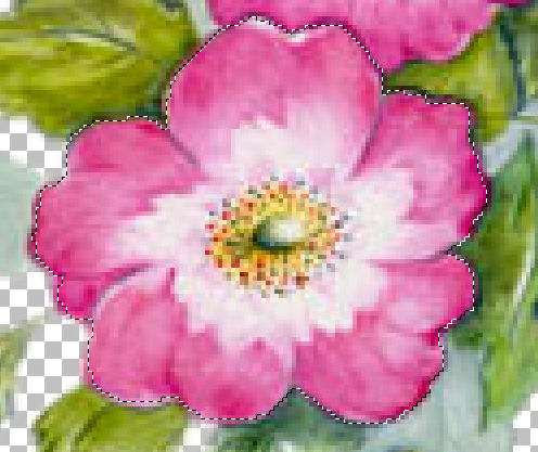
Here, I want to show you an example of pulling a flower out of a picture. You can see I followed the edges, without trying to be perfect.
You can see how it looks in the example at the bottom of this page.
OK, Now you have toys to play with :-)
Save them as a PSP file and you will have them to play with again.
Activate the clover you pulled out, Edit-Copy.
Activate the main image you left to make the clover.
Edit-Paste-As a New Layer.
With your Mover Tool, move it to the upper left corner.
Layers-Duplicate. Image-Mirror. Layers-Duplicate, Image-Flip. Layers-Duplicate, Image-Mirror.
Now you should have the clover in all 4 corners.
In the layer palette, x out the eye on the background layer, and Layers-Merge Visible.
Open the eye on background, highlight the shamrock corner layer and add a drop shadow, I think I used V & H at 2, opacity 100 and Blur 5.
If you are not going to do the animated part of this, you can add the butterfly to the tag as you like, or not :-)
If you are stopping at Part 1, add text here as you wish, and save at this point as described just below.
Layers-Merge-Merge All.
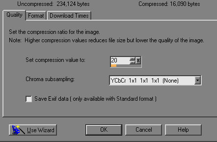
File-Export-JPEG optomizer with these settings.
Part 2
Now, we're going to work on the animation :-)
If your tag is not a single layer, Layers-Merge-Merge All.
Activate your butterfly. On the top bar of the butterfly, right click and choose Copy.
Activate your Tag. On the top bar of the tag, right click and choose Paste-As a New Layer.
In your layer palette, right click on the new layer and choose Rename, name it bfly1, then hit the Enter key on your keyboard.
With your Mover tool, move him to where you want to begin his flight.
Give him a drop shadow, I used V&H at 1, opacity 100 and blur 3 I think.
On the top bar of your tag, right click and choose Paste-As a New Layer, your butterfly is still in the clipboard.
Rename this layer bfly2, move it to the second stage of his flight, and give him a drop shadow.
Again, right click on the top bar of the tag and Paste-As a New Layer, rename as bfly3, move him to his third place and add the drop shadow.
One last time, right click on the top bar, Paste-As a New Layer, rename to bfly4, move him to his final flight place and add the drop shadow.
***Animation tip*** If you have him fly in a sort of circle with the last layer placing him where his next landing would be back at the start, your animation will "flow" naturally.
OK, now you should have 5 layers in your layer palette, the Background and 4 butterfly layers.
Next we're going to add the animated text. I used this same process to add the text to the non-animated tag at the bottom of this tut.
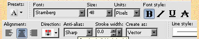
Choose your text tool with these settings.
Type the text you wish to put on the left of the frame in the middle of the tag.
With text in Vector mode, you have all the tools to manipulate it right there.
The side and corner nodes allow you to grab them and stretch or squish the text to the size you like to fit a space.
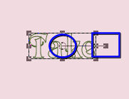
In the example below, there are 2 other tricks useful to vector text.
The center of the blue circle is the text mover, if you hold your cursor over the center of your text, you will see it will change to 4 arrows, when that happens, left click and hold on it and you can move the whole thing.
In the center of the square blue box is the turner. With your cursor held over it, the cursor will change to 2 curved arrows, left click and hold, and turn your text in the direction you desire.
Find them both and try them :-)
OK, now that you've found those spots and what they will do, let's get that text where it belongs.
With the "turner", make the text as verticle straight as you can, then grab the center and move it to the left of the tag where you want it. I did mine in the border, but you could do it inside the main image just as well. Getting it next to the border at least will show you if it's pretty straight up and down or if you need to grab the "turner" and adjust it a bit more.
Then I grabbed the center and moved it to the middle of that side, so the beginning of the text and the last letter was about the same distance from the corner shamrocks. Don't be crazy about being perfect, no one is going to measure it.....LOL
When you are happy with it, right click on that layer in the layer palette and choose Convert to Raster Layer.
Add a drop shadow. Repeat the last used or get creative :-) In my animated version, with my dark text, I used the light foreground color as the drop shadow color......
Now, type your top text in the middle of your tag. No turning for this part, just grab the center and move it up, center it in the space, convert it to a Raster layer and add your drop shadow.
Type your right text now, with the turner pull it down so the text will face the center, then move it to the right of the tag and center it, adjust as needed, convert to raster layer and add your drop shadow.
Finally, type your bottom text, move it down, convert it to a raster layer and add the drop shadow.
OK, now you almost have all your layers.
I renamed my text layers to keep up with them. My layer palette now looks like this.
We're almost done :-)
But the hardest part is just ahead.
And it really isn't hard, you just have to take extra care to watch what you are doing.
If I am going to boo-boo, this is where it happens.
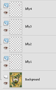
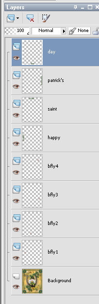
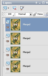
You now have 4 butterfly layers and 4 text layers. And one Background layer.
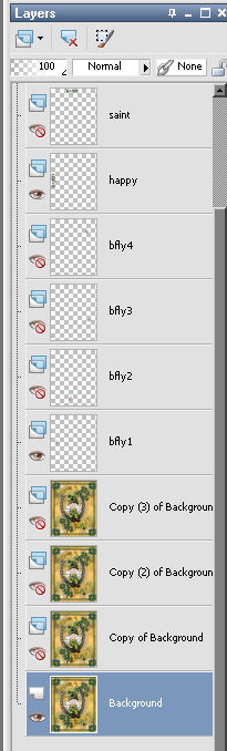
Right click on the Background layer and Duplicate, 3 times, so you now have 4 background layers too.
At this point, take the steps slow and carefully.
Close the eye on the top three layers of each type. You can see below I have the bottom Background highlighted, the first butterfly layer open and the Happy text layer open.
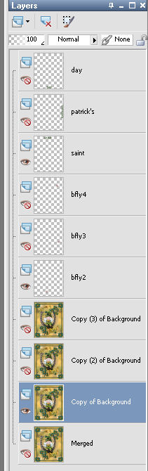
Making sure your bottom Background layer is still highlighted, right click on it and Merge-Merge Visible.
Close the eye on your new merged layer and highlight the Copy of Background layer. Open the eye on bfly2 and your second text layer.
Make sure your Copy of background is highlighted and right click on it and Merge-Merge Visible
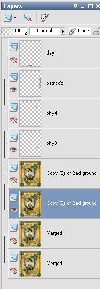
Close the eye on the second merged group and open and highlight the third copy(2) of background, the third butterfly and third text layers.
Finally, close the last merged layer, and open the eyes on the last three, making sure the copy(3) of background is highlighted, Merge-Merge visible.
If all went well, you should now have 4 merged layers.
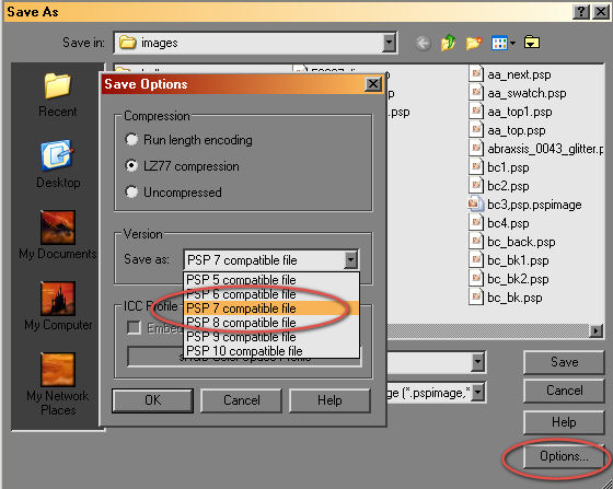
Open all the eyes, and File-Save As, a PSP file, making sure it is PSP 7 compatible by choosing that in the drop down box in the Options before hitting Save.
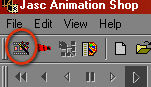
Animation Shop has not been upgraded since then.....LOL
Open Animation Shop.
Click on the little Wizard icon just under File.
Tick Same size as the first image frame.
Tick Opaque with black as the color in the next window.
Tick Upper left and With the canvas color in the next window.
Tick Yes, repeat the animation, and 50 as How Long in the next window.
In the next window, click on Add Image and locate the file you saved.
Then click Next, and Finish in the last window.
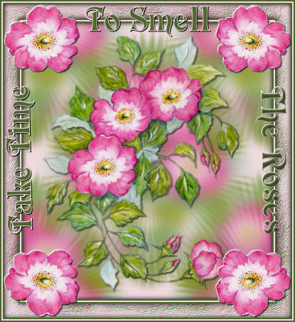
Your animation is created!
View-Animation and you will see how it looks.
File-Save As, name it and Save.
You're done !!
I hope you enjoyed it :-)